
[jimlee]
Traveling further east today, over the Atlantic in preparation for the Frankfurt Book Fair next weekend. A working trip, I will be once again back in Studio Gioco Duro with my studiomates italiani Lee "Hellboy" Bermejo and Cammo "Captain Atom" Comeondaiyoucan. It's only 9 hours from JFK and I will be snoozing all the way or checking out my new PSP which I just bought for the trip.
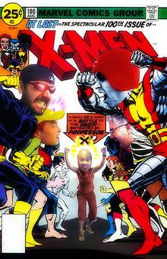
In the meantime, here is a file I found on my laptop--it's a sample of the kind of cover layouts I do. This time it was for the All-Star Wizard jam cover I did with Frank Quitely. I laid out the cover and then he did All-Star Superman and I did Batman. The two images were then composited by the magicians at Wizard to produce the cover which came out just several months ago. BTW, they went with layout C. If you were an editor, what would you have run with?

Subscribe to:
Post Comments (Atom)


9 comments:
D is dynamic, but C is best.
(B) It reminds me of the title splash page in HUSH 612 (chapter 5 "The Battle") It seems like the reader is about to have a gripping conversation with both characters. It's imminent and exclusive.
D is a bit too similar to a previous Batman Hush cover/poster. I think I would have preferred A, but C is definitely not a bad choice. Jim, should have given me some time to work my magic on your PSP. Could have dropped the firmware back to 1.50 and hook you up with some homebrew apps! Nothing better than playing old school classics on the road!
I like D. C is ok but I like the perspective in D more. Cool layouts, thanks for sharing.
I would have gone with A, because by nature I would think Batman avoids the spotlight-- Superman sorta leads the charge for shock factor, Bats follows in to start laying down the hammer amidst the chaos.
By choosing cover C, Wizard simply took advantage of an up-front Lee image, subversively moving the less copius Quitely to the back. Wizard's cover is soley about marketing, however, so they do as they must.
I gotta go with D, even though similar poses are used a lot. I really like the sense of action. C is good, but I D is better.
I would have gone with B. Similar spacing for the two characters. The emphasis on one character over the other is distracting.
Hey Jim,
what did you think of the PSP?
I think the movie and game quality are excellent but I bought the thing and have hardly touched it since. Maybe when they bring out more 'PDA-esque' accessories I will go back to it. What games / movies did you get?
I really like A. Great stuff all around!
Post a Comment