
 [Scott]
My first foray into the blogosphere! All of a sudden I feel like a 21st century renaissance man.
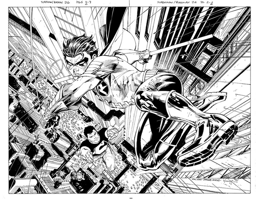
Eddy asked me to stop by and highlight some of my thoughts on inking this particular piece, which I am happy to do, and in no particular order.
This was a pretty straight forward ink job vis a vis working on top of Jim's pencils. The figure work was pencilled very tight, and you'll see very little deviation going from pencils to inks. If anything, I blew it in regards to Robin's right eye (on the viewer's left) in that the shape and size changes, getting a bit larger. I try and take great pains in staying as true to Jim's facial structure as possible, or anyone else I ink for that matter. The change here is subtle, but there is almost no such thing as TOO subtle when it comes to faces.
On the other hand, I made some minor changes to Robin's hair, since I feel I only need to keep the hairs flow and relative highlight patterns, but will generally simplify the details a bit. Other than line weights and contours, I didn't really change or feel the need to change much else. Superimpose the inks and the pencils on top of each other and jump back and forth. You'll be able to see a where I took a few artistic liberties.
The background was similarly complete, and the only alterations you'll see are some additions of detail structures in the rooftops, some added ledges and edges. I also splattered some detail in a few of the buildings blacks, as well as just off Robin's left hip (to separate him from the background a bit). Little bits of surface detail (dits and dashes) on the buildings are added, and added highlights to the speedlines complete most of my contributions.
Jim's pencils can be MUCH tighter than this or MUCH looser. Each requires I bring a different type of discipline to the table. Now that I've broken by "blogger's cherry", perhaps I can bloviate about these differences next time...
Later--
Scott


11 comments:
Awesome as usual, Scott! Great to see you posting! You're my ink hero, as you know! Thanks for posting your take on the process! ~DAN
HEY SCOTT, FROM ONE SCOTT TO ANOTHER WELCOME TO THE BLOG-O-VERSE,
YOU AND JIM WORK MAGIC TOGETHER IT JUST ISN'T THE SAME WITH ANYONE ELSE
PLEASE CONTINUE TO POST HERE WITH NEW ART EVERY WEEK
SEE U AT THE SAN DIEGO COMIC-CON
SCOTT
Awesome work scott and thanks for finally posting sir. I opened both at the same time and used the drawer feature with preview on my mac, to flip back and fourth between the 2 pieces and you are right not much variation at all. But what variation there was I definately could see, especially the hair and the rooftops among other things.
Nooooosssaa!!! está muito show essa arta!! esplêndida!...Até o superboy está perdendo no vôo..rsrsrsrs
Abraços...
Wow, I was going to request that we get to see something from you Scott! I don't feel like your name gets sung the praise it deserves and that we should see some of the work you put in on these images... and here it is.
Thanks, Scott, you are a very talented man. Made my morning.
Wow. Looks good, Scott!
By the way, I hope you're doing well!
Top stuff, as always, and welcome to the blogs (i am only a newb at it myself). And can i third the request for a tutorial? That would be awesome!
Cheers,
Great Scott! That's great, Scott! :D
Peace...
Great work Scott and interesting to hear your comments! Keep bloggin'.
Hey Scott,
It's awesome that you have finally come on-board the blog too! Of the Homage Studios artists your work has always been among the art that I most enjoyed.
I'd really be interested to hear what tools your are currently using in terms of brush or pen types, etc. -- in contrast to the tools you were using back on Uncanny X-Men or Strikeforce: Morituri.
On the HUSH series, some of the lines you pulled have a marker's chisel nib appearance. I've assumed it was a "calligraphy" tipped marker or pen, but it that's a brush technique...well I'm even more interested to hear what's what.
You were the first inker that made me realize how important inkers were. (I think I took Terry Austin for granted, giving all the credit to Byrne and Art Adams). Your work on the Deathlok perfect-bound mini-series, and your subsequent absence from some of the other issues made me see how vastly improved your inks made the final drawings.
Thanks for posting!
-Josh
Post a Comment