
 [Sinc']
When Eddy first asked me to include notes for the coloring of this spread, I was ready to give him 52 ;) reasons why I couldn't. Then I remembered how much working on this piece had meant to me because of who and what it was for. I had worked with Jeph (and Jim, Scott and the rest of the team) on Batman Hush and loved every page of that run. When I heard about the book and what was being done with it, I e-mailed Eddie Berganza (editor) letting him know to use me as much as possible on it.

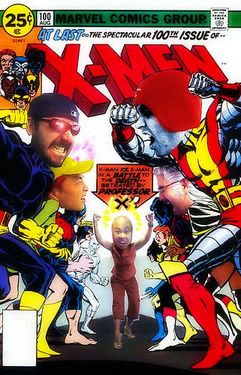
For this spread, I went for a dominantly cool palette throughout the city to pop the characters who have red, yellow and flesh as main colors. Since there is a ton of black and detail involved, I knew that value would have to play a big role in the final picture. The flat JPEG shows my starting point. As I started rendering, the city took on more of a monochromatic feel because I decided to use the same color to highlight everything with. I kept the light hitting the characters natural or white so the warm tones would jump out even more. The final JPEG shows all the glows on the piece. I added quite a few to play with the values, never messing with the blacks on the figures--> Values!


5 comments:
CooL!
Thanks for taking the time out for the 'Metti, Sinc'! Always glad to read of and see the process from you.
And many more thanks to you and Chris (inkblotz) for the Chiarello/interior design book recommendations! Great stuff! :D
Peace...
Its been great to see the whole process from roughs to colours. Thanks for everyone who took the time to comment on their part in the process, very insightful.
It is truly the world's finest! :)
sorry for the late reply-had the hardest time logging in. Thanks for the kind words. Nice to know you appreciate the work that goes into every one of these pages.
Sinc'
Post a Comment