 [Alex]
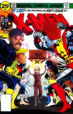
Using all the lighting established by Jim and Sandra, I start coloring the cover. I work dark to light, foreground to background.
For this cover I decided to use a very strong cool (foreground) vs warm (background) composition. I let the warm tones encroach onto the foreground elements so it all works as a whole. I use very defined "cut" shapes for the foreground figure and elements, especially metal ones.
In contrast, all background and atmospheric objects are rendered using textured and organic brushes. It still looks a little flat as far as depth goes, but I know that will get resolved as I do the FX.
Sinc'


No comments:
Post a Comment