(entry ricH)
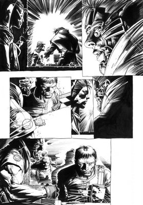
Here's an interior from WW #2. It's always interesting to see what you turn in and how it reproduces in the comic. Sometimes you get word ballons over things, other times special effects take out some line work that you've done, other times color can overwhelm or consume little details. I normally don't worry too much about it....it's part of the biz....and I am pretty used to it.
Wetworks 2 was pretty dark. I worked hard on a lot of the little things only to discover I couldn't see much of it...again part of the biz. Cool thing is...with the internet. You can always show it later.
So here's one that has a lot of work that is now presented in a way where you can really see the detail.
the scan is pretty huge so it might take a sec to upload.
r.


1 comment:
wow. cool you made a huge scan, thanks.
i also like the fact that it still has the original contrast, so we can see how you filled in the blacks or get the idea of what kind of tools you used.
panel 1 is really interesting. rough lines and detailed fades.
and the stitching of the coat in panel 2.
i wish i could ink my stuff like that.
how long did it take you to ink that?
cheers
B
Post a Comment